For over a century, reaching for a tin of Lyle’s Golden Syrup meant encountering one of the most distinctive and quietly macabre images in British grocery history. Emblazoned across the green-and-gold tin was an illustration of a dead lion, its carcass swarming with bees. It was an aesthetic anomaly in the modern supermarket aisle - a stark, Victorian remnant holding its own amongst brightly coloured mascots and sanitised corporate graphics. Yet, in February 2024, Tate & Lyle Sugars made headlines with the announcement that, after 141 years, the brand was introducing a significant redesign. The historic carcass was out, replaced by a stylised, minimalist lion’s head and a single, floating bee.
The decision to alter what Guinness World Records recognises as the world’s oldest unchanged brand packaging sent ripples through the British public and the international design community. It touched upon an ongoing debate within contemporary branding: the tension between preserving authentic heritage and adapting to the sensibilities of a twenty-first-century audience. To understand why Lyle’s made this shift - and why they astutely chose to apply it only to a specific segment of their product line - requires examining the religious origins of the original mark, the pressures of modern retail packaging, and the psychological weight of consumer nostalgia.
The Biblical Origins of a Pantry Staple
To grasp the full weight of the rebrand, one must look back to 1883, when Scottish businessman Abram Lyle registered the original trademark. Lyle was originally a cooper and shipowner in Greenock, Scotland, whose fleet transported sugar across the globe. Eventually, he established a sugar refinery in London, producing a thick, amber by-product of the sugar refining process that he famously named "Golden Syrup."
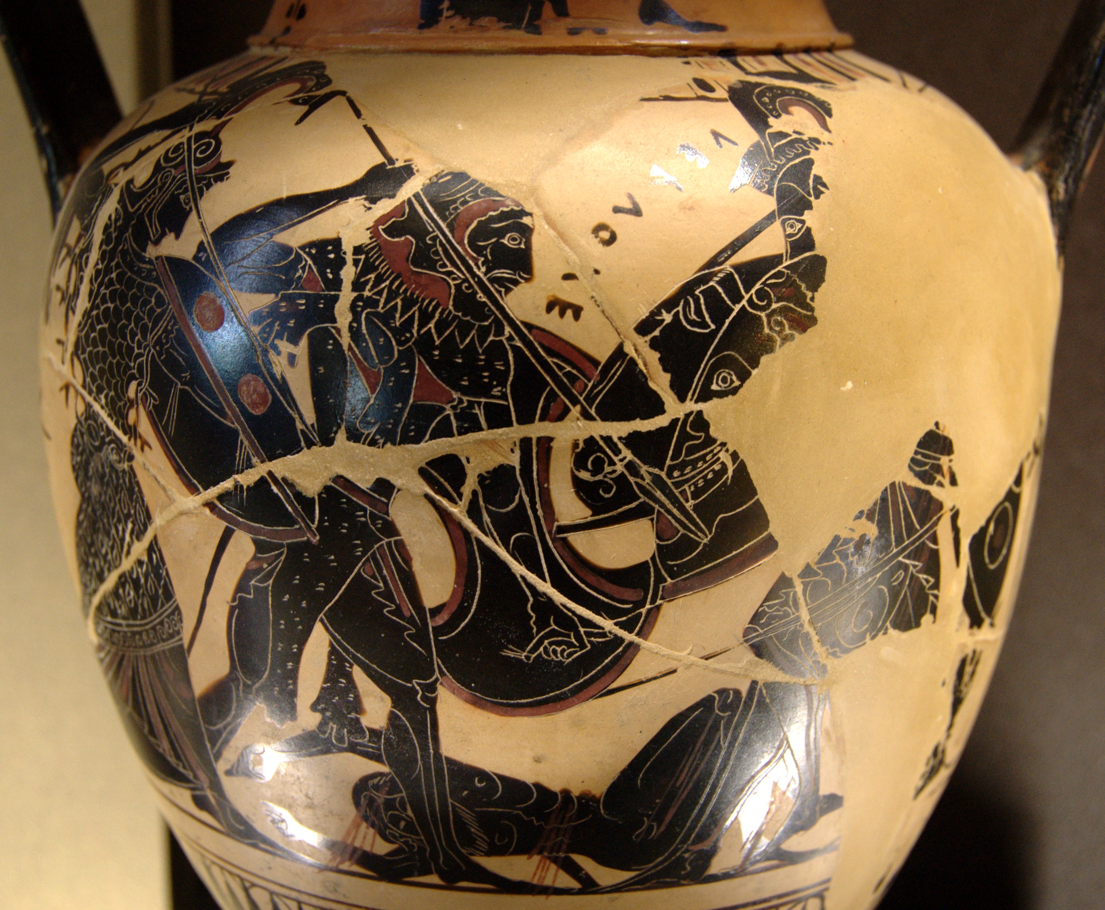
Unlike modern brands, which are often conceived in boardrooms following extensive market research and focus groups, Lyle’s original branding was a deeply personal reflection of its founder's devout religious beliefs. The image of the lion and the bees was drawn directly from the Old Testament Book of Judges. It depicts a story in which Samson travels to Timnah and is attacked by a lion. He tears the beast apart with his bare hands. Returning later, he discovers that a swarm of bees has formed a hive within the lion’s carcass, producing honey. Samson eats the honey and later presents a riddle to his wedding guests: "Out of the eater, something to eat; out of the strong, something sweet." Lyle adopted a variation of this riddle - "Out of the strong came forth sweetness" - as the brand's enduring tagline.
For a Victorian audience, such biblical allegories were commonplace, even on commercial products. The imagery served as a moral anchor, aligning the industrial manufacture of sugar syrup with virtues of strength, providence, and divine reward. In 1921, Abram Lyle's business merged with that of rival Henry Tate to form Tate & Lyle, but the Golden Syrup branding remained fiercely independent and fiercely untouched. As Britain secularised over the twentieth century, the religious context faded from public consciousness. To the modern consumer, the logo simply became a quirky, slightly grim illustration that they accepted without question, purely because it had always been there. It became a piece of British cultural furniture, a fixture in baking cupboards that evoked memories of childhood treacle tarts and Sunday morning pancakes.
Moving with the Times: The 2024 Redesign
The catalyst for the February 2024 rebrand was not necessarily a sudden distaste for the original logo, but rather the practical demands of modern packaging formats and changing consumer behaviour. The new logo - a clean, simplified vector rendering of a lion's head with a solitary bee nestled above its mane - was rolled out specifically for the brand's plastic squeezy bottles and dessert toppings.
James Whiteley, the brand director for Lyle’s Golden Syrup, positioned the update as a necessary step for future-proofing the product. "We're excited to unveil a fresh redesign for the Lyle's Golden Syrup brand," Whiteley stated during the launch. "While we'll continue to honour our original branding with the heritage tin, consumers need to see brands moving with the times and meeting their current needs. Our fresh, contemporary design brings Lyle's into the modern day, appealing to the everyday British household while still feeling nostalgic and authentically Lyle's."
Whiteley’s comments highlight a critical challenge in modern Fast-Moving Consumer Goods (FMCG) design strategy. Products packaged in plastic squeeze bottles are marketed primarily for convenience, targeting busy families, younger consumers, and those looking for an easy topping for porridge or waffles. On a smaller, contoured plastic bottle, the intricate line work of an 1883 Victorian illustration can quickly become an illegible smudge. A simplified, scalable graphic ensures that the brand remains instantly recognisable on supermarket shelves, where consumers make purchasing decisions in mere seconds, and on digital grocery platforms, where thumbnails dictate visibility.
The Minimalist Shift in Contemporary Packaging
The Lyle’s redesign is emblematic of a broader movement within visual culture and corporate branding over the past decade. Often referred to pejoratively as 'blanding' or 'debranding', this trend sees companies shedding complex, three-dimensional, or highly detailed logos in favour of flat, minimalist vector graphics. From luxury fashion houses like Burberry and Balenciaga to automotive giants like Volkswagen and Peugeot, the shift toward simplicity is ubiquitous.
The rationale is largely driven by digital consumption. Logos must now perform seamlessly across a multitude of formats, from large-scale billboards to tiny favicons on mobile web browsers. A highly detailed illustration of a decaying lion simply does not render well on an iPhone screen. By stripping the logo down to its core identifiers - the lion and the bee - Lyle’s created a versatile asset that functions efficiently in digital marketing campaigns and e-commerce environments.
Furthermore, typography plays a significant role in this shift. The ornate, Victorian lettering that accompanied the original tin has been streamlined on the new plastic bottles, replaced with a more legible, contemporary typeface that speaks to modern efficiency rather than nineteenth-century craftsmanship. However, this design philosophy is not without its critics. When brands flatten their visual identities, they risk eroding the idiosyncrasies that made them memorable in the first place. The original Lyle's logo possessed a gothic charm; it was delightfully weird. The new iteration, while undeniably professional, clean, and modern, trades that weirdness for approachability. It is a safer design, stripped of its macabre narrative, sanitised for a public that perhaps no longer wishes to think about carcasses while drizzling syrup over their breakfast.
Heritage Preserved, Controversy Ignited
What makes the Lyle’s Golden Syrup rebrand a masterclass in brand management, however, is the caveat embedded in the announcement. While the squeezy bottles adopted the minimalist lion, Tate & Lyle Sugars made the astute decision to retain the original 1883 illustration on their classic green-and-gold tins.
This dual-track strategy mitigated what could have been a catastrophic public relations backlash. The British public is famously protective of its heritage brands. Redesigns of national staples - whether it is Royal Mail, Marmite, or PG Tips - inevitably draw intense scrutiny. When a beloved aesthetic is altered, it is often interpreted not just as a corporate update, but as an erasure of cultural memory. Nostalgia acts as a powerful anchor; in an era defined by rapid technological and social change, a familiar tin of syrup in the pantry provides a small, tangible sense of stability. By keeping the dead lion on the tin, the company successfully appeased traditionalists, preserving its Guinness World Record and its status as a historical artefact, while simultaneously launching a more functional aesthetic for its modern product lines.
Despite this clever compromise, the announcement still ignited a predictable wave of discourse. Social media commentators lamented the loss of character, arguing that the sanitised lion lacked the striking visual impact of the original. Meanwhile, some religious groups expressed disappointment at the perceived distancing from the brand's biblical roots, interpreting the removal of the carcass and the associated tagline as a capitulation to secular modernism. The reaction underscored a fundamental truth about legacy branding: consumers do not just purchase a product; they purchase the emotional resonance and history attached to its packaging.
The Tightrope of Legacy Branding
The evolution of the Lyle’s Golden Syrup logo serves as a compelling case study in how heritage brands navigate the twenty-first century. It highlights the delicate balancing act required to attract a new generation of consumers without alienating the loyalists who view the brand as an extension of their own personal history.
Abram Lyle’s biblical lion survived two World Wars, numerous changes in corporate ownership, and over a century of shifting dietary trends. Its partial retirement from the squeezy bottle range is not a failure of the original design, but rather an acknowledgement that visual communication has fundamentally changed. The new logo prioritises immediacy, legibility, and modern warmth - qualities essential for competing in today's crowded retail environment where clarity often supersedes complexity.
Yet, the fact that the original carcass and its swarm of bees remain stubbornly present on the classic tin is deeply reassuring. It proves that there is still commercial value in history, and that sometimes, a brand's greatest asset is its willingness to embrace the strange, enduring aesthetic of its past. Lyle's Golden Syrup has managed to step forward into the modern day without severing the roots that kept it anchored for 141 years, proving that out of the old, something fresh can indeed come forth.