Film colour grading is the stage of post-production where a colourist and the cinematographer adjust the colour, brightness and contrast of every shot, first so that shots match and then so that the whole film carries a deliberate look. To understand it as a viewer, watch four things: which colours dominate the frame, how deep the blacks go, how skin is rendered, and how all three change as the story moves. Once you know that grading began as a laboratory craft of printer lights and chemistry, and that the first Hollywood feature graded entirely on computer was released in 2000, the look of almost any film becomes easier to read.
Colour grading at a glance
- Correction comes first. Footage shot on different days, under different light, rarely matches. The colourist balances it so the eye does not snag on accidental jumps.
- The look comes second. Warmth, coolness, saturation, contrast and the treatment of particular colours are then pushed towards the film's intended mood.
- It is a collaboration. The cinematographer usually sits in on the grade, and the director signs it off. Much of the look is already built on set through lighting, lenses, costume and production design.
- The tools are precise. Modern grading software can isolate a single hue, a part of the frame or a moving object and change it independently.
- It is delivered more than once. A film is often graded for cinema projection, for standard television and for high dynamic range (HDR) screens, and each version needs checking.
How a grade is built
Most grading starts with primary corrections that affect the whole image. The three standard controls are lift, gamma and gain: lift moves the shadows and sets the black point, gamma moves the midtones where faces usually sit, and gain moves the highlights and sets the white point. Adjusting the balance of red, green and blue in each range is how a colourist removes a colour cast or adds one on purpose.
Secondary corrections then work on selected parts of the picture. A colourist can key a range of hues (all the greens in a field, say), draw a shape around a face, track it as the actor moves, and treat that region separately. This is where a film gets its signature: a sky pushed towards cyan, a dress made slightly redder, foliage drained of life.
Colourists check their work on calibrated monitors and on scopes. In a Frame.io guide to colour scopes, Charles Haine of Brooklyn College's Feirstein Graduate School of Cinema explains that the waveform maps brightness across the frame, while the vectorscope shows where colours land on a colour wheel and can display a "skin tone line" marking where typical skin registers. He also warns against grading by numbers, comparing heavy reliance on scopes to driving while staring at the speedometer: the eye does the creative work, the scopes stop it drifting over a long session.
Behind all this sits colour management, the system that keeps an image consistent from camera to cinema screen. The best known framework is the Academy Color Encoding System. The Academy Software Foundation's ACES project page describes it as "the global standard for color management" and lists Wicked, The Wild Robot and Captain America: Brave New World among productions that used it. ACES 2.0 arrived in spring 2025, and the ACES 2 documentation says its redesigned rendering transforms use a gentler tone curve with less aggressive midtone contrast. On 6 August 2025 the project moved from the Academy of Motion Picture Arts and Sciences to the Academy Software Foundation (checked October 2026).
Delivery standards shape the grade too. Standard high-definition television follows the International Telecommunication Union's Recommendation BT.709, and HDR television follows Recommendation BT.2100, revised in February 2025, which defines the PQ and HLG methods. The same film can therefore look subtly different on a phone, a living-room set and a cinema screen, because each version is a separate trim of the same grade.
From printer lights to the digital suite
Colour control in film began long before computers. Technicolor's three-strip process, which filmcolors.org's Timeline of Historical Film Colors dates to 1932-1953, came with a Color Advisory Service directed by Natalie M. Kalmus. Its consultants helped productions plan a "color score", coordinating sets, costume, make-up and lighting with the narrative, and its stated philosophy was restraint: "Colors should subtly convey dramatic moods and impressions to the audience." The timeline's examples include Black Narcissus (1947) and The Red Shoes (1948), both made by Powell and Pressburger in Britain. Little White Lies has a readable history of Natalie and Herbert Kalmus and their influence.
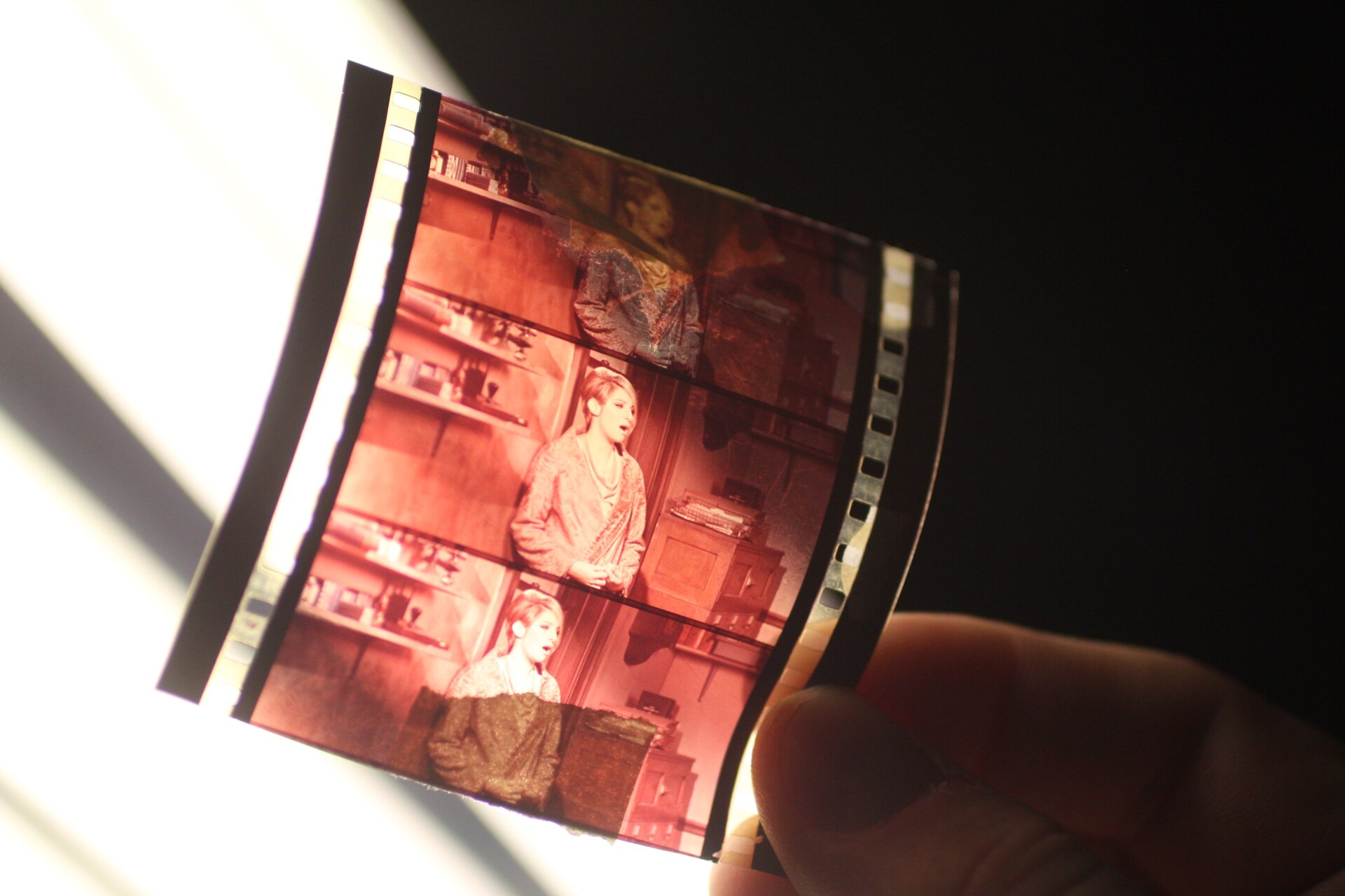
For most of the twentieth century, the job now called grading was called colour timing, and it happened in a laboratory. Retired timer Jim Passon describes on Lowepost how a timer viewed the negative on a film analyser such as a Hazeltine and set printer lights, "usually from a 1 to 50-point scale for each color (Red, Green, and Blue)", shot by shot. Those controls changed the whole image at once: there was no way to brighten only the shadows or recolour a single object. Colourist Cullen Kelly notes in a Frame.io piece on lessons from the celluloid era that printer points were derived from f-stops, which gave labs and cinematographers a shared, measurable language.
More radical looks had to be made chemically. Bleach bypass, also called skip bleach or silver retention, leaves silver in the film alongside the colour dyes, laying a black-and-white image over a colour one. Roger Deakins used it on all release prints of Nineteen Eighty-Four (1984), and Janusz Kamiński used a partial version, Technicolor's ENR process, on Saving Private Ryan (1998). No Film School describes the result as desaturated colour, hard blacks and heavy grain, aimed at the feel of 1940s combat newsreels.
The shift to digital came with O Brother, Where Art Thou? (2000). Deakins wanted a dry, Depression-era look, but the Mississippi locations were lush and green. As SlashFilm reports, he said photochemical tests "ended up being like six different chemical processes" without success. Instead, the negative was scanned at Cinesite in Hollywood, colourist Julius Friede and Deakins turned the greens to dusty yellows and browns, and the result was recorded back to film. It became the first major Hollywood feature to be finished entirely through a digital intermediate, and the process took more than eleven weeks. Archived discussion on the Cinematography Mailing List shows cinematographers discussing at the time how the film was scanned on a Spirit datacine, manipulated and output back to film.
Today the tools are widely available. Blackmagic Design's DaVinci Resolve, now at version 21, has a free edition alongside its paid Studio version (checked October 2026), which means students can practise on the same kind of colour page used in professional suites.
What to look for on screen
Palette and accent colours
Note the dominant colours of walls, costumes, skies and props, then notice which colour is allowed to break the pattern. A narrow palette makes a single accent loud. In a muted war film, a red cross or a bloodstain carries far more weight than it would in a bright one.
Black levels and contrast
Look at the darkest part of the frame. Dense, true blacks feel decisive and graphic. Raised, milky blacks feel softer, older or more anxious. Contrast changes the emotional weight of a face without changing a word of the script, which is why the bleach bypass look still reads as harsh and documentary.
Skin
Skin is the anchor of most grades, and colourists protect it even when the rest of the frame is pushed hard. When skin goes green, grey or deep orange, ask whether that is the point: illness, cold, exhaustion, an artificial world, or simply a fashionable look applied without thought.
The colour arc
Compare the opening and closing reels. A film may begin neutral and grow colder as pressure builds, or shift palette sharply to mark a flashback, a dream or a change of reality. Gradual change usually follows a character; abrupt change usually marks a boundary in the story.
What the grade did not do
Many effects are not grading at all. Lighting, filters, lens choice, film stock, costume and set colour are decided earlier, and a grade can only shape what was captured. Reading interviews with cinematographers, such as those published by the American Society of Cinematographers, is the most reliable way to learn which choices were made on set and which were made in the suite.
The teal and orange question
The most argued-about look of the digital era pairs warm, orange skin with cool, teal shadows and backgrounds. On 14 March 2010 the blogger Todd Miro published Teal and Orange: Hollywood, Please Stop the Madness, arguing that because skin sits in the orange range, pushing everything else towards its complement makes actors "pop", at the cost of lighting that could never coexist in nature.
Fresh data suggests the look never went away. In an analysis published in September 2026, film data researcher Stephen Follows measured 8,135 feature films, one frame per shot, from 1930 to 2025. By his measure the look peaked around 2009-2010, fell to 15% of films in 2015, then rose to "30% in 2025, the highest ever measured". His more surprising finding is that orange actually declined while teal grew: teal made up 1.8% of the frame in the 1990s and 8.6% in the 2020s. He cites Dune: Part One as having the lowest score of any well-known film of the 2020s, a useful counter-example to study.
The lesson for viewers is not that teal and orange is wrong. It is that a look becomes meaningful when it follows the film's logic, and becomes wallpaper when every film shares it.
How to practise reading a grade
- Pick a scene with strong atmosphere and watch it once without pausing. Write one sentence on how it made you feel.
- Watch again and pause every few shots. Describe temperature (warm or cool), saturation (muted or vivid), contrast (soft or hard) and any accent colour in plain words.
- Watch a third time for faces only. Do they look natural, flattered or deliberately distorted?
- Compare two versions where you can. Trailers, older home-video releases and newer restorations often differ in grade, and the differences teach you what the controls do.
- Check the production record. Look for interviews with the cinematographer or colourist to separate on-set choices from grading choices.
- Try it yourself. Grading a few minutes of your own phone footage in free software shows quickly how small changes in lift or gamma alter mood.
Keep notes specific. "The second half cools the shadows and lowers saturation on skin" is useful; "beautiful colours" is not. For more on reading visual culture, see the rest of our coverage at Art & Culture UK.
Frequently asked questions
What is the difference between colour correction and colour grading?
Correction fixes technical problems and makes shots match, such as an uneven white balance or a jump in exposure between angles. Grading is the creative layer that gives the film its look. In practice the same colourist does both, usually in that order.
Who decides how a film is graded?
The colourist operates the controls, but the look is normally agreed with the cinematographer and approved by the director. On O Brother, Where Art Thou?, Roger Deakins worked in the suite with colourist Julius Friede for weeks.
Why do some films look washed out on television?
Often the viewing setup is to blame: picture modes, room light and HDR settings all change what you see. A film may also have separate cinema, standard and HDR versions, each a different trim of the grade.
Was colour manipulation possible before digital grading?
Yes. Technicolor's colour consultants planned palettes on set, laboratory timers balanced every shot with printer lights, and processes such as bleach bypass changed contrast and saturation chemically. Digital grading made selective, local changes practical.
Photo: Revulo.Studio, CC0, via Wikimedia Commons