Book covers influence reading because they are the first information a reader gets, and people use that information to guess genre, tone and quality before they read a word. The influence is measurable but smaller than the myth suggests: in UK survey data for the year to May 2024, 13% of book purchases were influenced by the front cover, rising to 30% for books discovered in a physical shop. A cover rarely decides alone. It works alongside the author's name, the publisher and recommendations, and it frames how the first pages are read.
Book covers and reading at a glance
- Covers sort before they persuade. A cover tells you, in a second or two, whether a book belongs to a kind of reading you want right now: a saga, a thriller, a literary novel, a field guide.
- The effect is strongest when you browse. NielsenIQ BookData found cover influence is highest for impulse buys and in-store purchases, and lowest where readers arrive with a title already in mind.
- Some categories depend on it more. Children's activity books, annuals and picture books lead, followed by visual non-fiction such as art, crafts and nature; in fiction, sagas, romance and historical novels are most cover-led.
- Attractiveness matters more than literal accuracy. In a Canadian experiment, an attractive cover raised interest in a new book; a cover that closely depicted the content did not have a significant effect.
- Screens change the rules. Online, a cover is often seen at thumbnail size, so contrast and a legible title count for more than fine detail.
A short history of the selling cover
For most of the nineteenth century, the decoration of a book lived on its binding, and paper wrappers existed only to protect it. The earliest English-language publisher's jacket on record was made in 1829 for the gift annual Friendship's Offering for 1830. It was identified at the Bodleian Library in Oxford by Michael Turner, the library's former head of conservation, and announced in 2009, according to the history of the dust jacket compiled from the original reports. Unlike a modern jacket it wrapped the whole book like a parcel, and the Long Now Foundation's note on the find records "traces of sealing wax where the paper was secured". The previous record holder, found by the bookman John Carter in 1934, was on The Keepsake for 1833.
By around 1920, artwork and blurbs had largely migrated from the cloth binding to the paper jacket, which is the moment the cover became a selling surface in the modern sense.
British paperback publishing then showed how much a cover could do with very little. Penguin Books was founded in 1935 by Allen Lane and his brothers Richard and John; its first paperbacks cost sixpence, and an order of 63,000 copies from Woolworths proved the model, as the history of Penguin Books sets out. The Design Museum's account of Penguin explains that Lane insisted on "a simple horizontal grid" in colours that "signified the genre of each book: orange for fiction, green for crime, and blue for biography". Edward Young, the office junior, sketched the penguins at London Zoo for the logo and designed the first ten covers, including Ariel and A Farewell to Arms.
The point of the colour code was recognition, not beauty. A browser at a Woolworths counter could tell what kind of reading was on offer before picking a book up.
How Penguin turned design into a reading contract
The German typographer Jan Tschichold arrived at Penguin in 1946. According to the Design Museum, he "designed a template for all Penguin books with designated positions for the title and author's name", and between 1947 and 1949 he reworked around 500 titles and wrote the Penguin Composition Rules for editors and compositors. The cover and the interior became one consistent promise: a Penguin would be legible, well set and trustworthy, whoever wrote it.
That consistency eventually looked tired. In 1961 the Italian art director Germano Facetti was brought in, and he commissioned Romek Marber to redesign the green crime series. Marber produced twenty Penguin Crime covers between June and October 1961, and his layout, now known as the Marber grid, gave more than two thirds of the cover to an image, with series, title and author in bands across the top. Facetti then adopted it, essentially unchanged, for the blue Pelican and orange fiction lists.
The shift matters for reading. The 1935 covers told you the category; the 1960s covers added an image that set the mood for the story inside. The University of Bristol's Penguin archive, which holds the company's records from 1935 to the 1990s, is the place to see that history in the original files.
What designers say a cover should do
Chip Kidd, the long-serving designer at the American publisher Knopf, gave the clearest working definition in his TED2012 talk on book design. Stories, he said, "all need a face. Why? To give you a first impression of what you are about to get into." He also called a cover "a distillation. It is a haiku, if you will, of the story."
Kidd's first design lesson, from his Penn State teacher Lanny Sommese, is the most practical test of a cover you will find. Sommese drew an apple and wrote "Apple" under it, then told the class: "You either say this, or you show this. But you don't do this." Showing and saying the same thing at once, Kidd added, "is treating your audience like a moron". A good cover leaves a gap that the book fills.
His own Jurassic Park jacket shows the method. Instead of illustrating a scene, he traced a dinosaur skeleton from a diagram in a book bought at the American Museum of Natural History gift shop: a single image built from the book's own premise of rebuilding dinosaurs from fragments.
What the research shows about covers and choice
The best UK data comes from NielsenIQ BookData's monthly survey of about 3,000 book buyers. Its September 2024 analysis, Go ahead, buy the book for the cover, reported that in the 12 months to May 2024, 13% of UK purchases were influenced by the front cover: 15% of print books, 18% of impulse buys, 19% of in-store purchases and 30% of books discovered through physical shops. Over the three years to May 2024, 20 authors had at least a fifth of their sales influenced by the cover, and for Alexandra Potter the figure reached a third.
That puts the familiar claim that covers sell books in proportion. Covers do not decide most purchases. They decide a meaningful minority, and they matter most at exactly the point the brief describes: browsing a shop table with no fixed plan.
Academic work points the same way. In an experiment presented at the 2005 AIMAC arts management conference, What Makes People Want to Read a Book?, Alain d'Astous, François Colbert and Imene Mbarek of HEC Montréal tested five factors on interest in new books. The author's reputation, the publisher's reputation and the attractiveness of the cover all had significant effects; how closely the cover represented the book's content did not, and the author's reputation only counted for the management books, not the novels. In plain terms, readers responded to a cover that looked appealing, not to one that literally depicted the plot.
There is a link between interest and attention, too. In a 2023 study in npj Science of Learning, Bains, Spaulding, Ricketts and Krishnan asked adults to read book synopses and then decide whether to wait a few seconds to see the cover. Those who enjoyed a synopsis more were 2.57 to 2.80 times more likely, per standard deviation of enjoyment, to wait, and enjoyment went with better comprehension. Wanting to see the cover turned out to be a usable signal of engagement with the text itself.
Covers on screens and in feeds
Discovery has moved. NielsenIQ's 2025 report on the age of social reading found that, in the year to March 2025, video sharing, social media, book clubs and personal recommendations all reached their highest recorded share of books bought for oneself in the UK, and that three quarters of books discovered through video sites were bought by 13 to 34 year olds. A cover now has to work in a hand held up to a phone camera, as well as on a shelf.
Online shops add a technical constraint. Amazon's Kindle eBook cover requirements specify an ideal image of 2,560 by 1,600 pixels, a height to width ratio of at least 1.6:1, JPEG or TIFF files under 50MB, and suggest a 3 to 4 pixel medium grey border on white or pale covers so they do not dissolve into the white store page (checked October 2026). The same cover may be seen at full size on a tablet and at the size of a postage stamp in search results, which is why bold type and simple shapes tend to win online.
Why "don't judge a book by its cover" is only half right
The proverb is older than most people think. The Phrase Finder traces a version to the Boston Daily Advertiser in 1821 ("a man who judges of a book by its outside show") and the modern wording to a Boston Daily Mail headline of 12 June 1849. George Eliot's The Mill on the Floss (1860) is often cited, though it carries the idea rather than the fixed phrase. In the Project Gutenberg text, Mr Tulliver admits he bought a set of volumes because "they've all got the same covers", only to conclude: "it seems one mustn't judge by th' outside. This is a puzzlin' world."
Tulliver's mistake is worth remembering. He assumed a uniform binding meant uniform content, which is exactly the inference a series design invites. The cover told him something true about the publisher and the price, and nothing about the sermons inside.
How to read a cover before you read the book
- Read the codes, then test them. Note what genre and pace the cover promises, then read the first two pages in the shop or the online sample to see whether the prose keeps that promise.
- Look past the image to the small print. Publisher, imprint, translator credit and edition all tell you more about what you are getting than the artwork.
- Treat quotes and badges as marketing. A shout line from another author or a prize sticker is information about positioning, not a verdict.
- Compare editions. The same text often appears under several covers in different markets or formats; seeing them side by side shows how much is packaging.
- Notice when a cover is doing the work for you. If you are drawn by the cover alone, that is the 13% effect in action: fine for a gift or a gamble, worth a pause for a long novel you will live with for weeks.
Frequently asked questions
Do book covers change how a book is read?
They set expectations about genre, tone and pace, and readers bring those expectations to the first pages. Research has measured covers' effect on interest and choice more than on interpretation, so claims about covers changing comprehension should be treated with care.
How much do covers affect book sales in the UK?
NielsenIQ BookData found that 13% of UK book purchases in the year to May 2024 were influenced by the front cover, and 30% of books discovered in physical shops.
Which books depend most on their covers?
Children's activity books, annuals and picture books, then visual non-fiction such as art, photography, handicrafts and nature. In fiction, sagas, romance and historical fiction show the strongest cover influence.
Who designed the first Penguin covers?
Edward Young, then the office junior, designed the first ten covers in 1935 using Allen Lane's three-band, colour-coded scheme. Jan Tschichold standardised the design from 1946, and Romek Marber's grid followed in 1961.
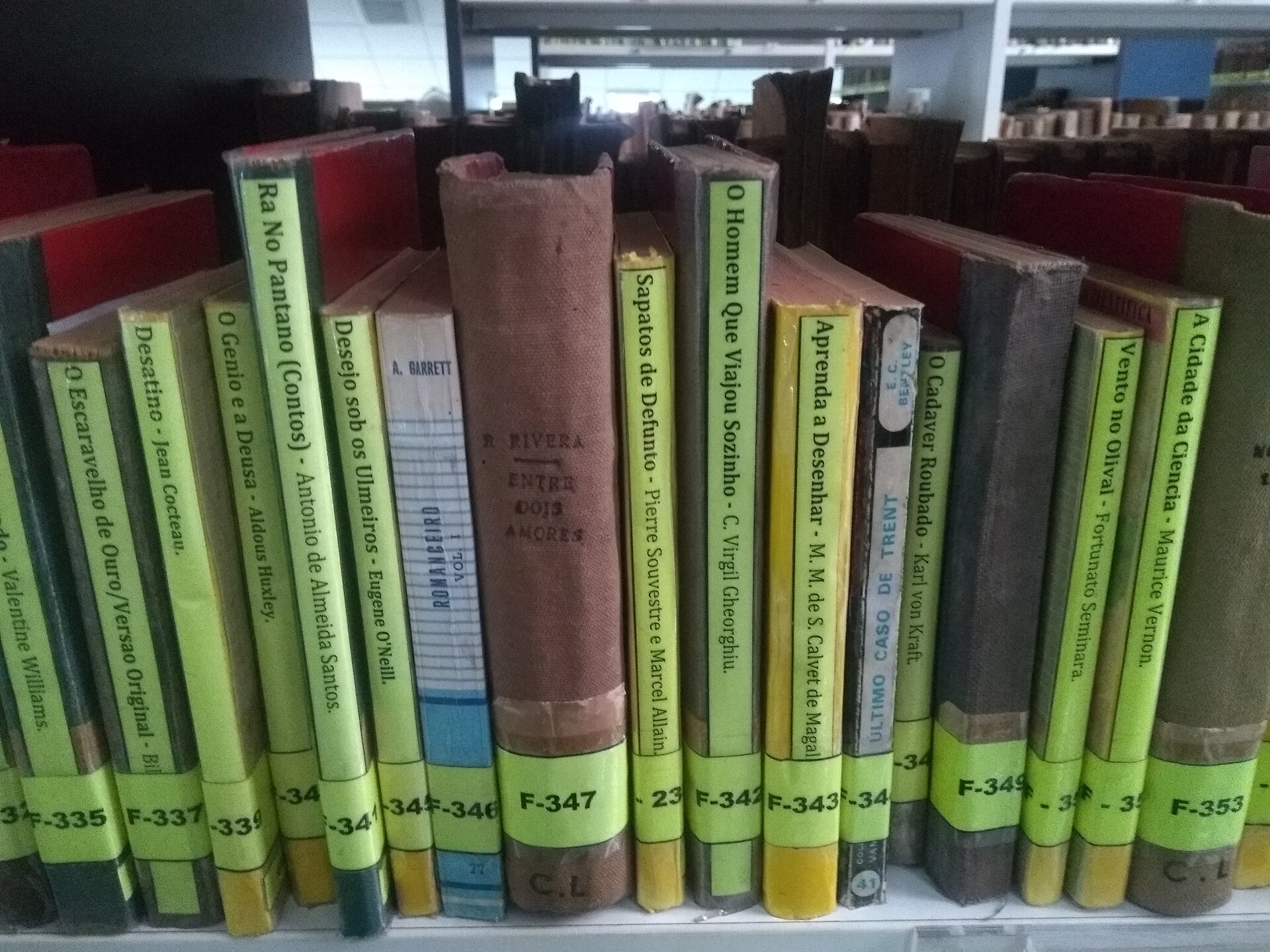
Photo: Fredericknoronha, CC BY-SA 4.0, via Wikimedia Commons